Simplifying Discovery
Redesigned search filters to improve usability and content visibility.
00
context
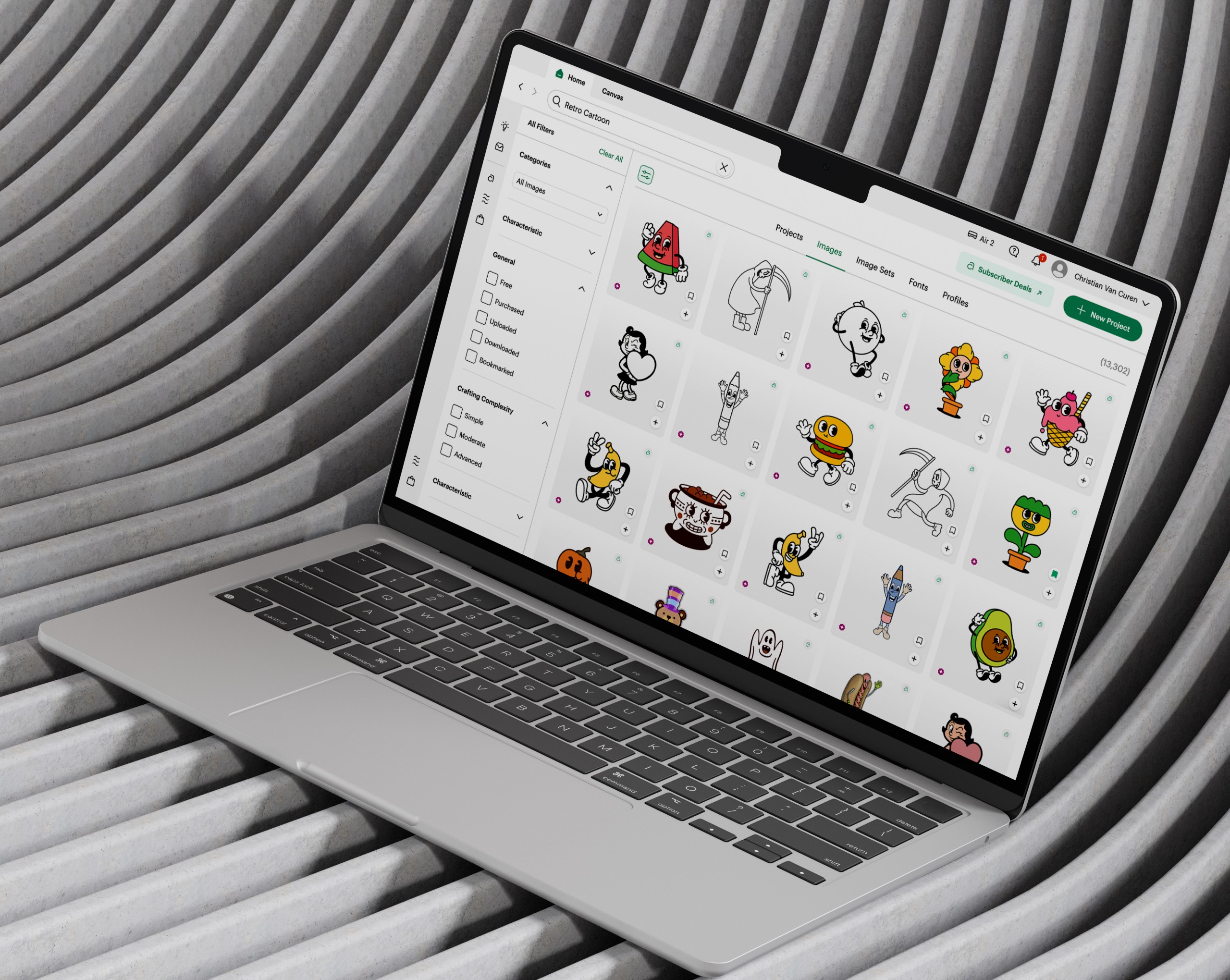
Cricut's Design Space is where millions of makers browse and search a catalog of tens of thousands of images and projects. On the Search pod, my work centered on discovery, helping users cut through a dense catalog to find the right content fast and stay in their creative flow.
problem
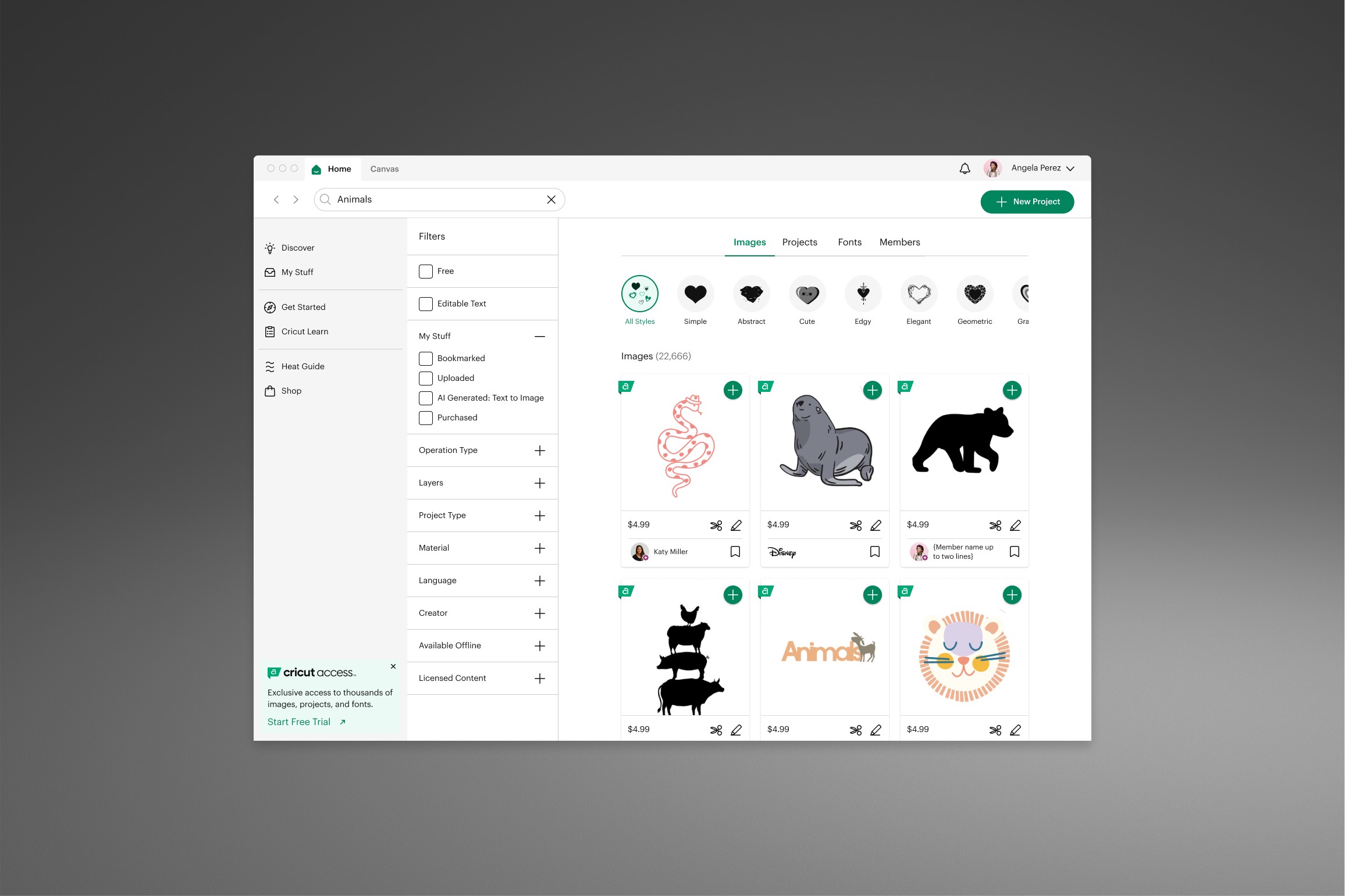
When I joined the Search pod, one of my first projects was rebuilding the filters. The existing ones were misaligned with our UI, offered little user value, and couldn't be collapsed. With the left navigation always open and filters fully expanded, over 45% of the screen was consumed, leaving just 55% for actual results. The layout buried content, lengthened search time, and dragged on conversion.
old feature
goals
Improve filter panel behavior by enabling collapsible filters and defaulting the left navigation to closed, reducing screen clutter and friction. Introduce research-backed filters that help users find content faster and more efficiently. Design project-specific filters to accelerate discovery and streamline search workflows.
success criteria
Users can collapse the filter panel and navigate without interference from the left-hand nav, reclaiming screen space for results. Users can locate desired content faster using the new research-backed filters. Project-specific filters reduce search time and make project discovery more efficient and intuitive.
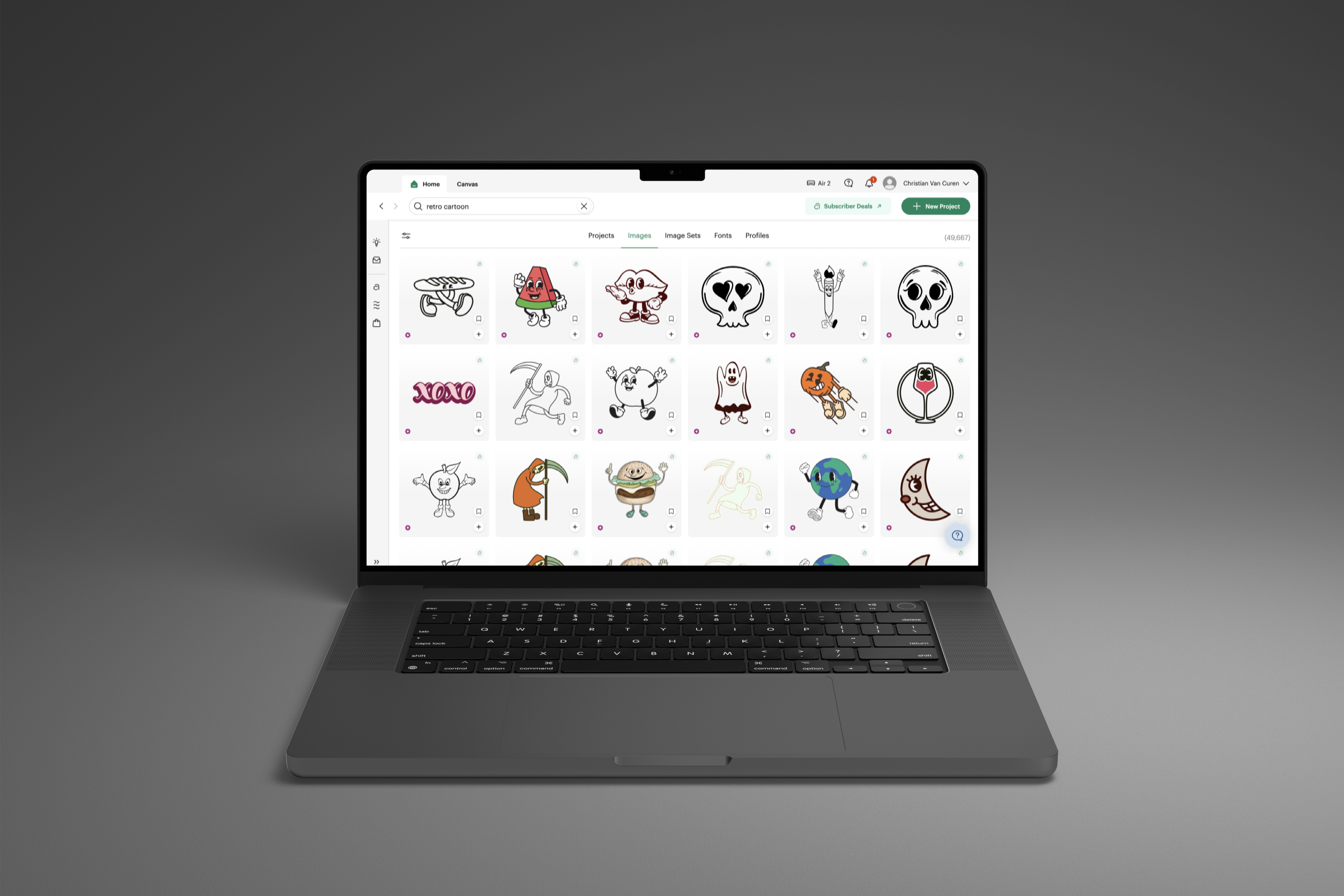
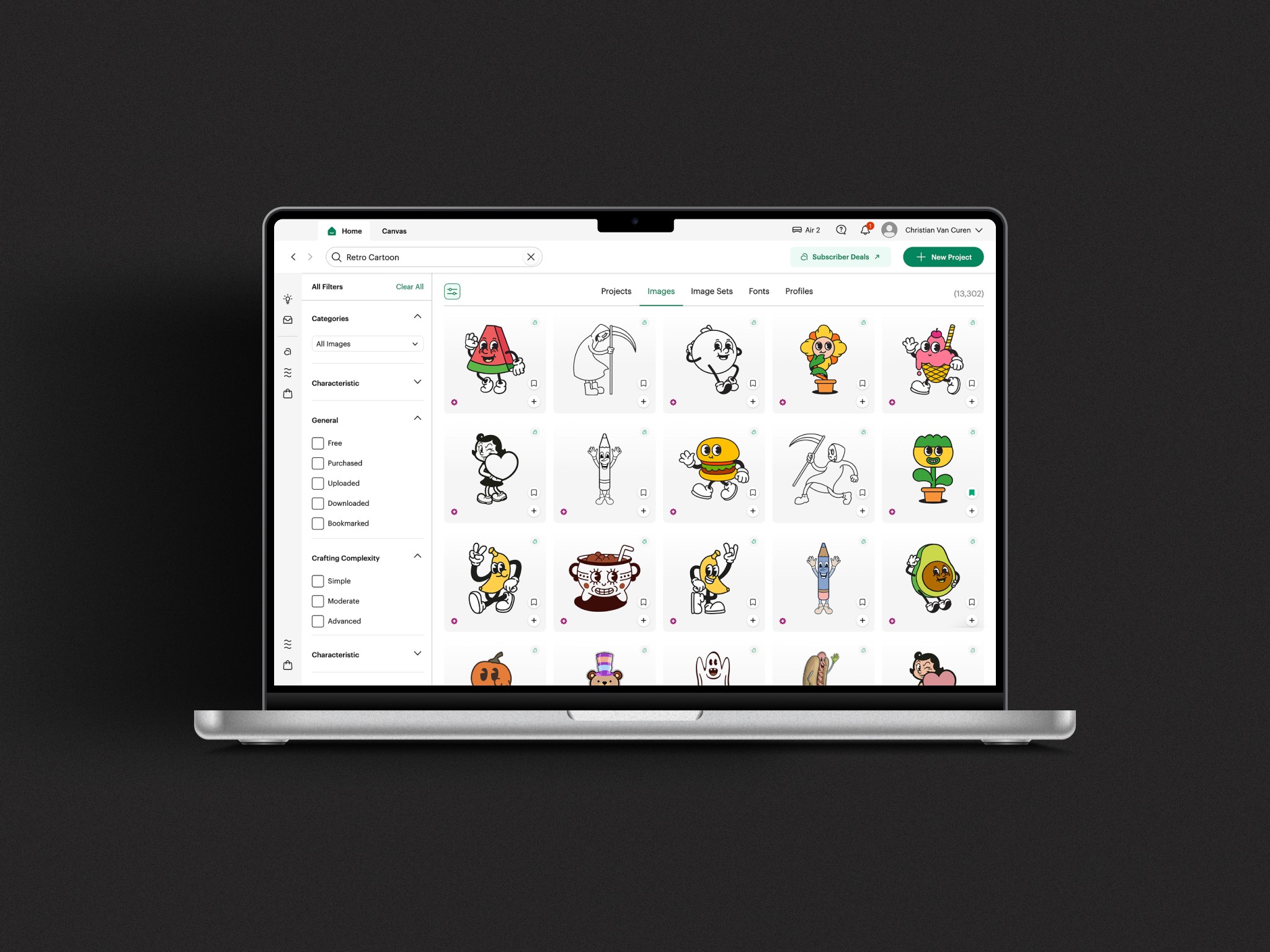
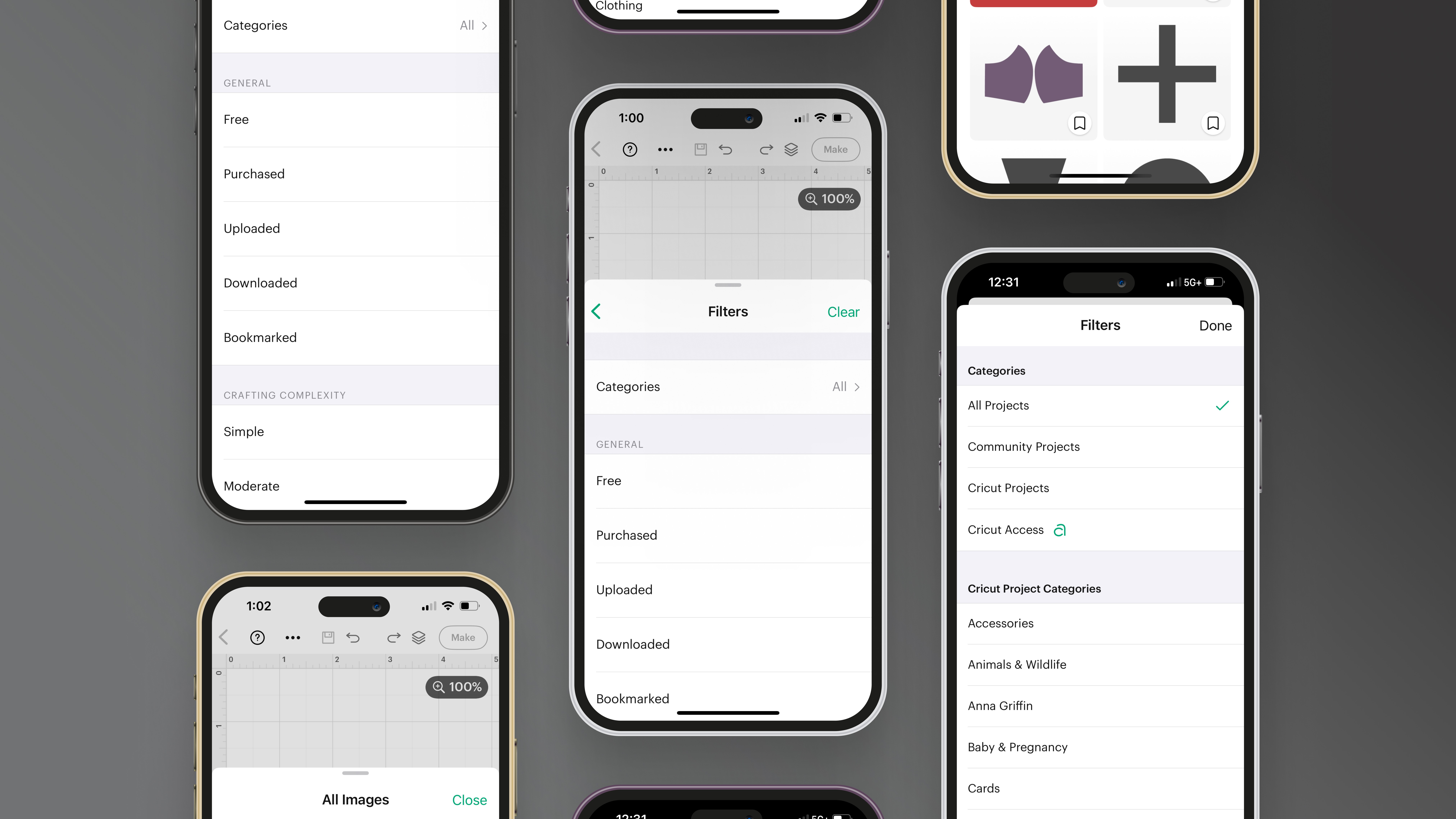
I led a complete rebuild of the filter panel to improve content visibility and intent-based discovery. The solution introduced research-backed filters, enabled a collapsible panel, and prevented the filters and left navigation from being open simultaneously—reclaiming screen space and reducing friction during search. The final design established a new filtering standard across Design Space and was rolled out incrementally to measure impact.
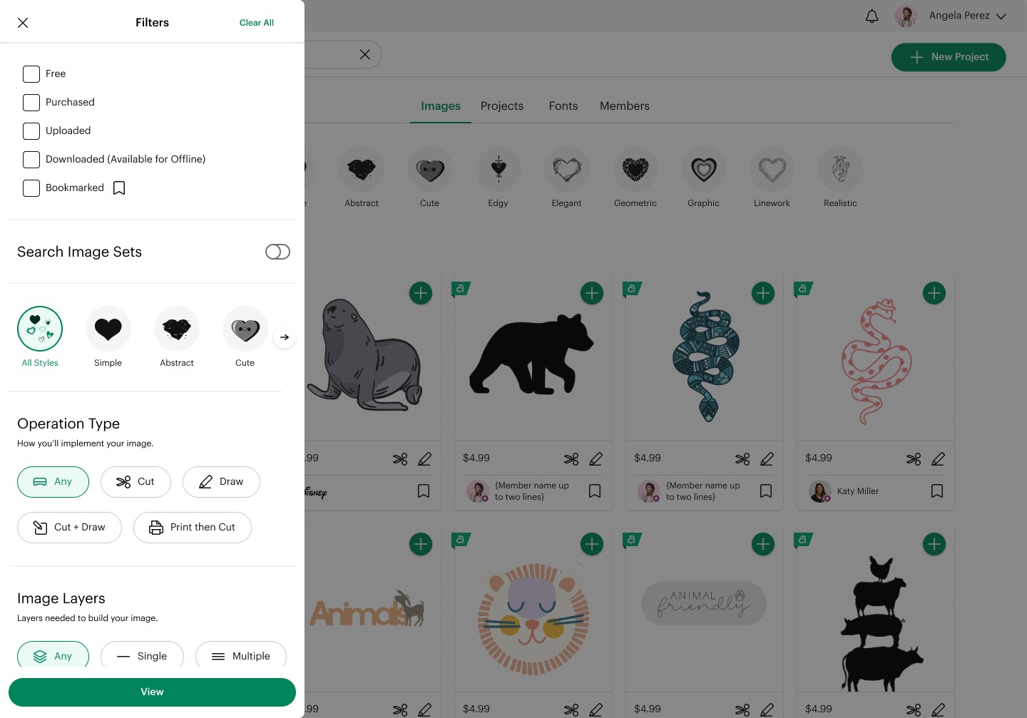
Initial exploration focused on aligning filter behavior with the Universal Search hierarchy.
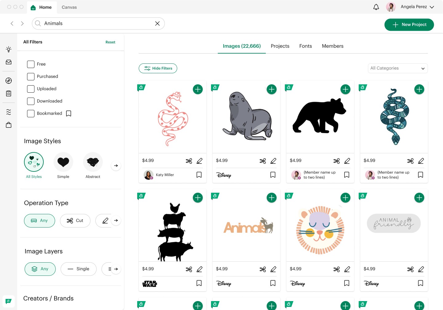
Based on early feedback and some competitive analysis, I pivoted the designs to better align with users’ current mental models.
Key Features I Led:
Research-backed filters: Introduced filters grounded in user insights to make content discovery faster and more intuitive.
Collapsible filter panel: Reclaimed screen space and reduced friction by allowing users to hide filters when not needed.
Design System standard: Established a scalable filtering pattern applied consistently across Design Space.
The rebuilt filter system flipped the ratio the old layout got wrong. Where filters and navigation once ate 45% of the screen, the new collapsible panel takes at most 25% — and drops to zero when hidden — giving results 75% to 100% of the space instead of 55%. The result was a cleaner, less cluttered search experience that the Cricut community responded to well. On desktop it became the filtering standard across Design Space, replacing the old pattern entirely — and it set the foundation for the filter work that followed.
year
2024 - 2025
timeframe
1 year
tools
Figma
category
UI/UX
01
02
03
see also