Designing the Subscription Lifecycle
Owning the end-to-end subscription experience — redesigning how users sign up, check out, and cancel across every platform.
00
context
As the UX designer for Cricut's Subscriptions team, I own the subscription experience end to end. Cricut's membership sits at the center of how makers get value from Design Space, so the flows around it — signing up, paying, staying, leaving — directly shape both user trust and business outcomes.
problem
The subscription lifecycle had friction at nearly every step. Signing up took too many screens, checkout was long and disconnected, and cancellation was a blunt, all-or-nothing exit. Each rough edge cost conversion, retention, or clarity — and with millions of members, small improvements compounded fast.
old feature

goals
Reduce friction across the highest-impact subscription flows. Connect each design decision to a clear business outcome — conversion, retention, or clarity. Establish consistent, scalable patterns across every platform.
success criteria
Users move through sign-up and checkout with fewer steps and less cognitive load. Members have real alternatives to cancelling outright. The subscription experience feels consistent across desktop, iOS, and Android.
Core Flows
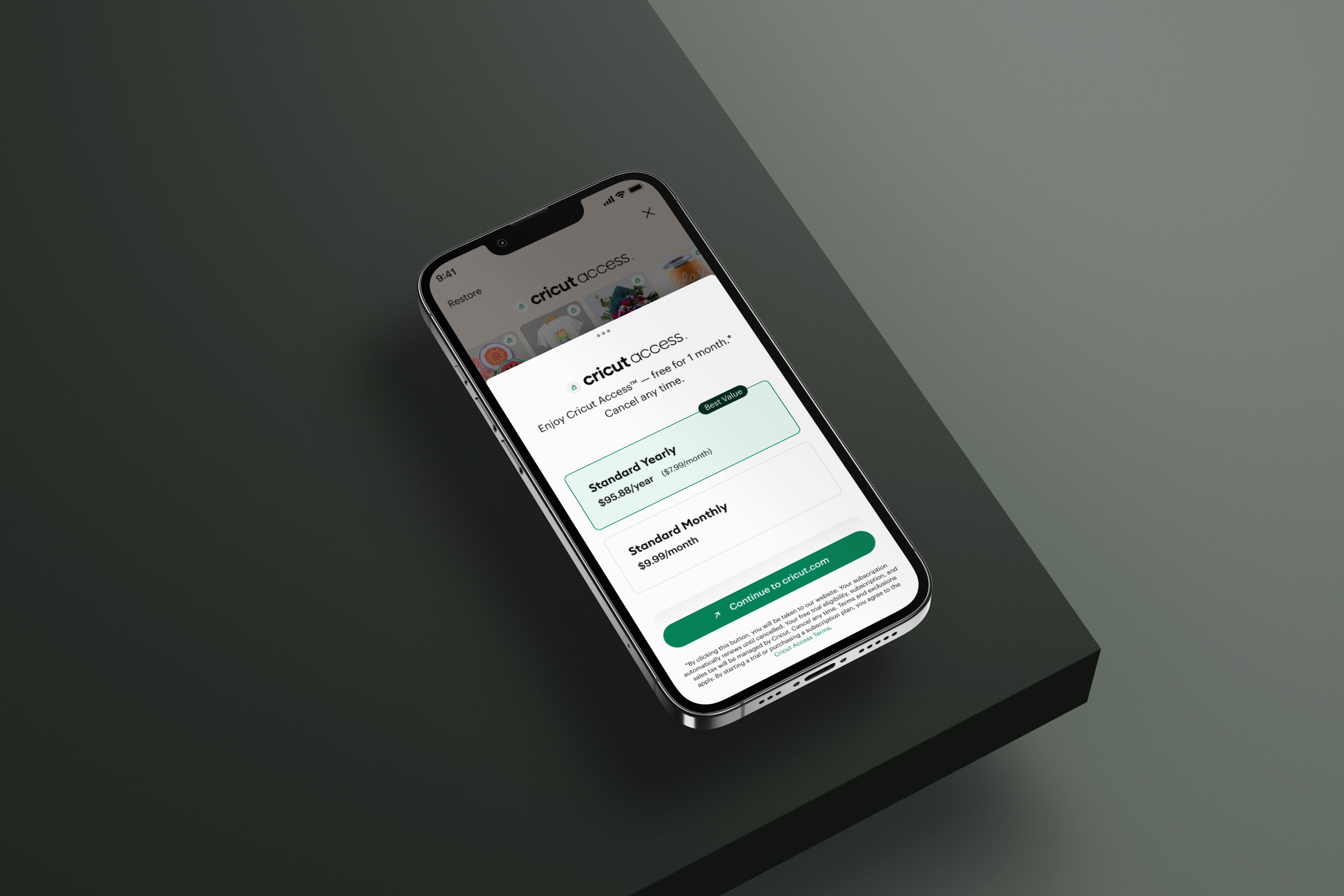
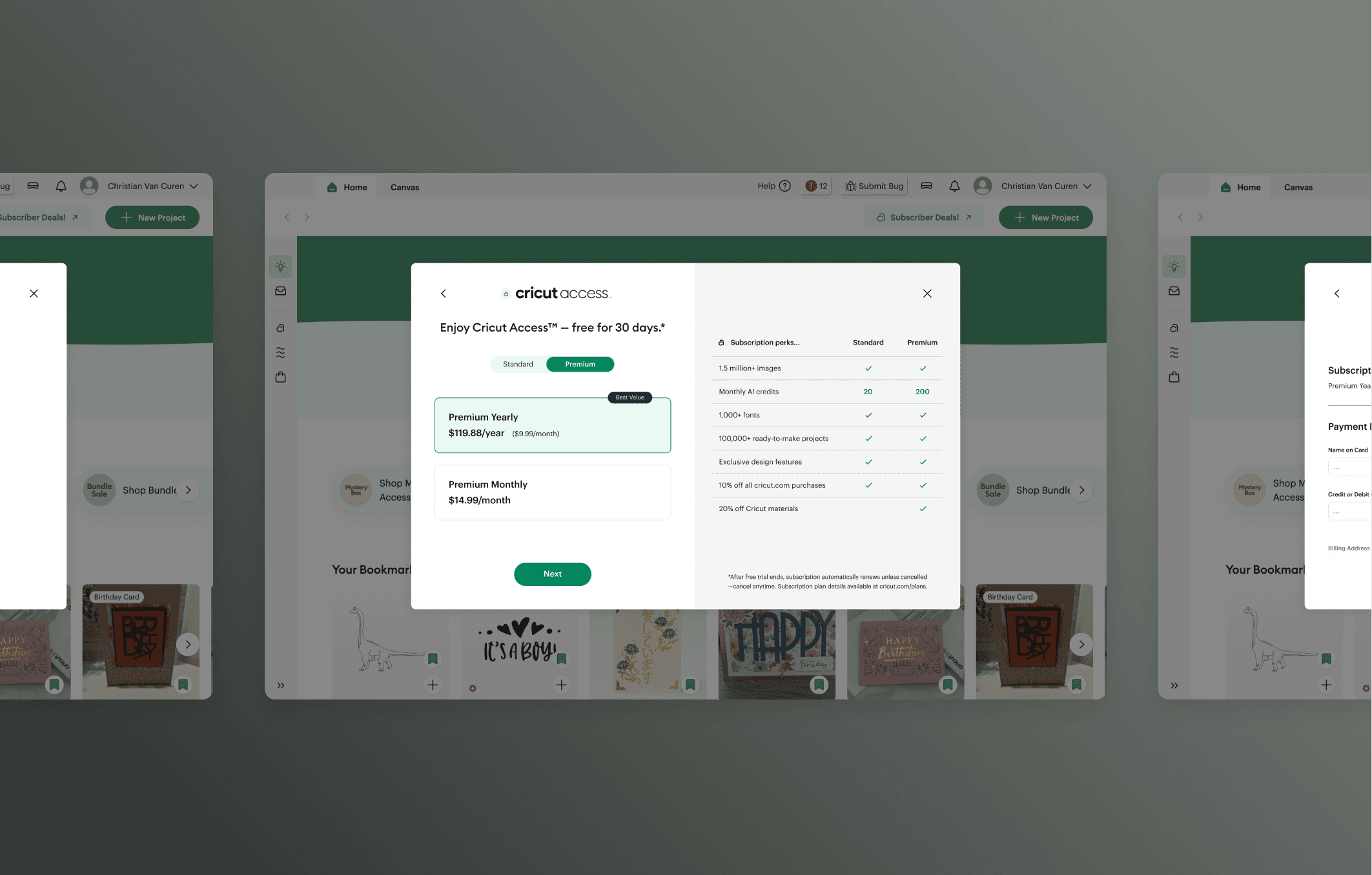
Sign-Up — The old sign-up ran about five screens — enough drop-off and cognitive load to cost real conversions. I redesigned it to two. I also brought premium directly into the flow: users land on the premium tier first, with a simple toggle to compare it against standard, making the upgrade a clear choice rather than a buried one. The streamlined flow shipped across platforms and has contributed over $1M in incremental monthly revenue, and climbing.
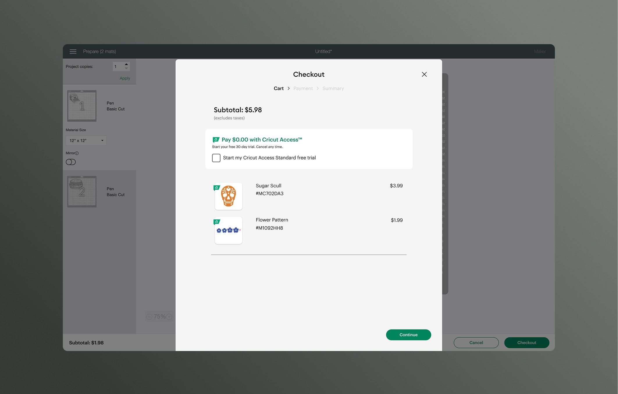
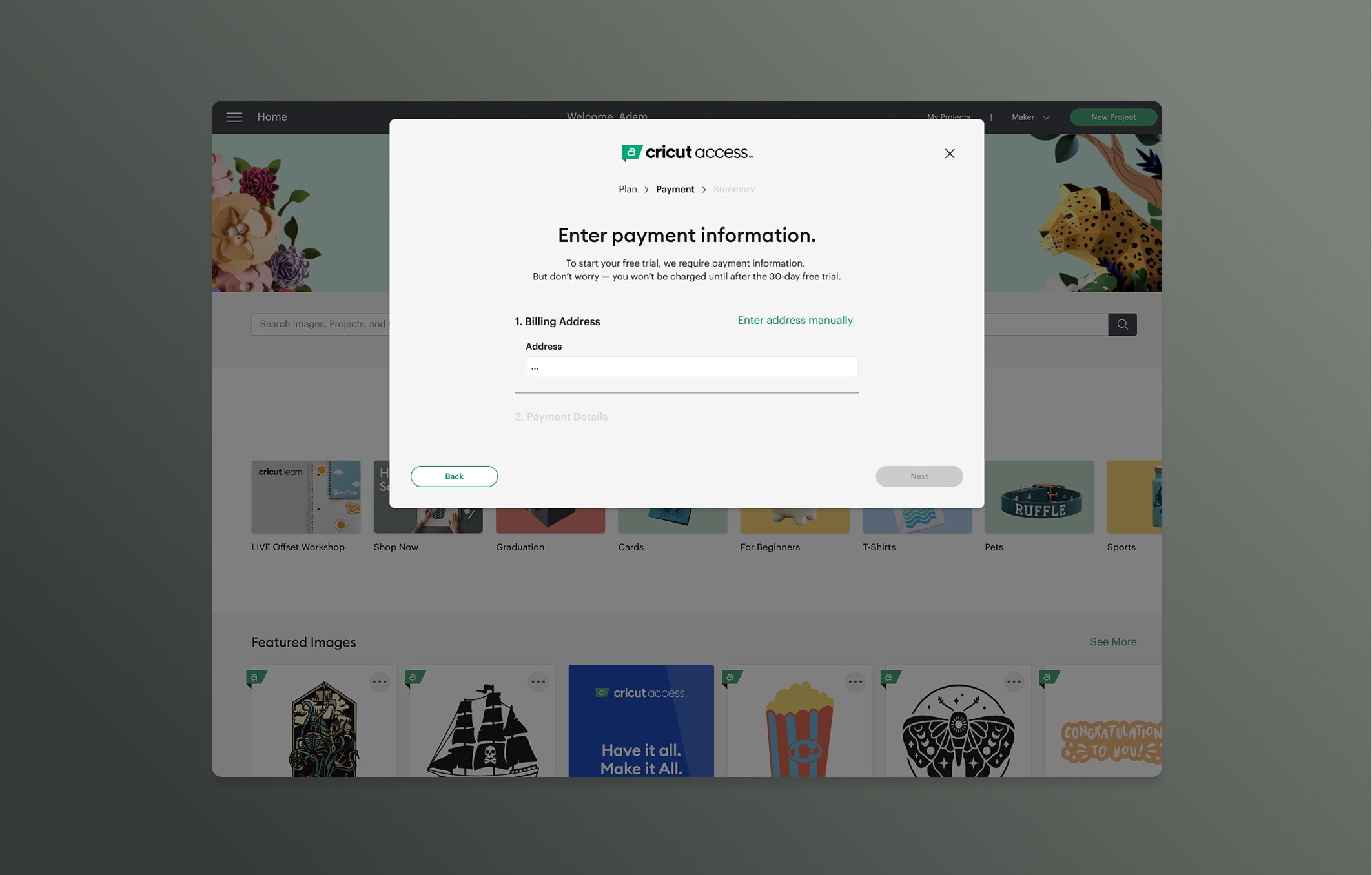
Checkout — Checkout was long and visually disconnected from the rest of the experience. I rebuilt it into a shorter, consistent flow that now shares a unified theme with the surrounding experience — and it has become one of the product's highest-converting surfaces, with conversion climbing from 15% to 22% and making it our second-highest-converting placement. I'm currently refining it further, testing an even shorter variant.

Cancellation — Cancellation used to be all-or-nothing. Everyone who entered the flow left because there was no other path. My first version changed that, giving users real options before cancelling. It converted roughly 35–40% of would-be cancellers into members who stayed, up from zero. It had flaws, but it worked. For the second version, I moved the exit survey to the front and redesigned the flow around it. So instead of asking why someone's leaving on the way out, the flow uses that reason upfront to route them to the most relevant option: a targeted offer for some reasons, a pause for others. That version just shipped, and I'm watching to see how it moves retention further.
Across sign-up, checkout, and cancellation, the redesigned lifecycle reduced friction while directly moving the metrics that matter — driving over $1M in incremental monthly revenue, lifting checkout conversion, and creating retention where there was none. Owning these flows end to end, across desktop, iOS, and Android, established a consistent subscription system and set the standard for how the experience evolves.
year
2024 - 2026
timeframe
+2 years
tools
Figma
category
UI/UX
01
02

03

see also