Designing Templates into Search
Introducing templates as a new searchable content type; designing the tile system, filter architecture, and search experience across every platform.
00

context
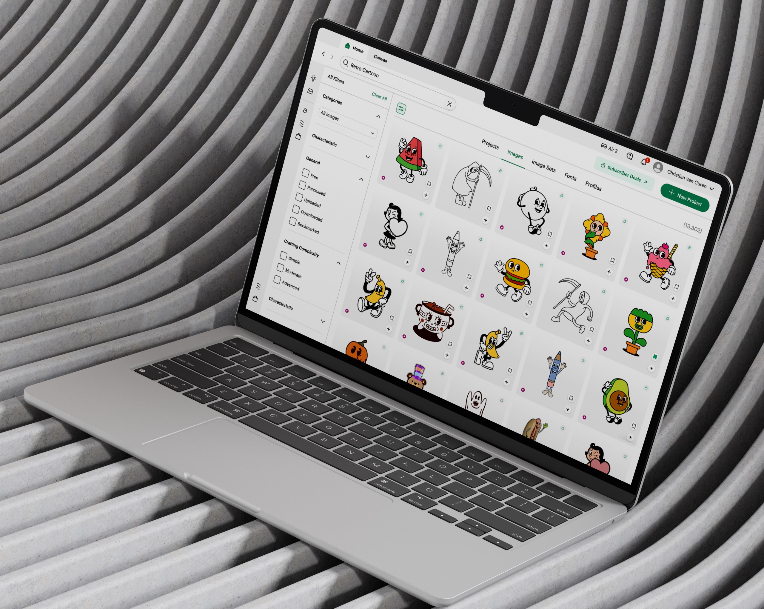
Cricut's Universal Search let makers find images, projects, and fonts across Design Space. Ahead of a new machine launch, we needed templates to become a fourth searchable content type. A change that sounds simple but broke assumptions our search and filter systems had been built on for years.
problem
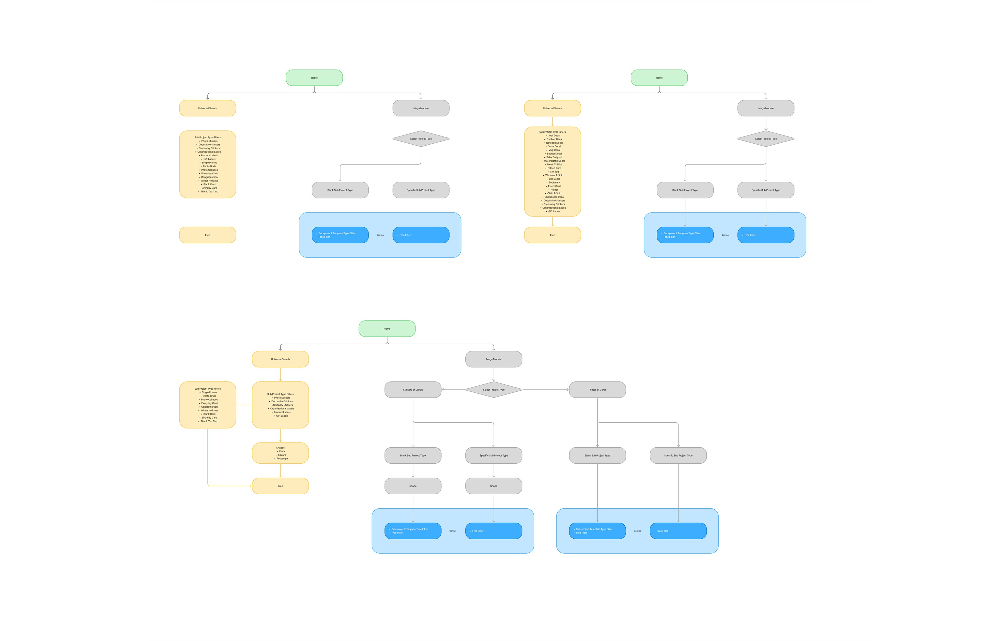
Templates weren't just new content to index; they carried structure the existing system couldn't handle. Template tiles ranged wildly in proportion — a phone case and water bottle are nothing like a notebook or T-shirt — so the search result grid needed a sizing system that held up across every project type. Filtering was even tougher: users select a project type, subtype, and even a shape depending on the machine before entering Canvas, which meant the filters shown in Universal Search had to diverge from the ones in Canvas, creating two related-but-distinct filter systems that had to stay coherent. And all of it had to ship in time for the machine launch.
old feature

goals
Introduce templates as a first-class searchable content type in Universal Search. Design a tile system that stays visually coherent across radically different template proportions Build a filter IA that works across two contexts — Universal Search and Canvas — without fragmenting the experience.
success criteria
Users can find and use templates alongside images and projects, with no added friction. The grid holds up visually whether a template is tall, wide, or square. Filters feel consistent across Universal Search and Canvas despite serving different pre-Canvas selections.
I led this work end to end, from IA through final UI, partnering with two designers and developers on the tile-sizing system. The core challenge was structural: I mapped how the pre-Canvas project-type selector cascaded into filter variants, then designed a filter IA that kept Universal Search and Canvas coherent while respecting their different entry points. For the search results grid, we built a proportional sizing system so templates of any shape sat together cleanly.
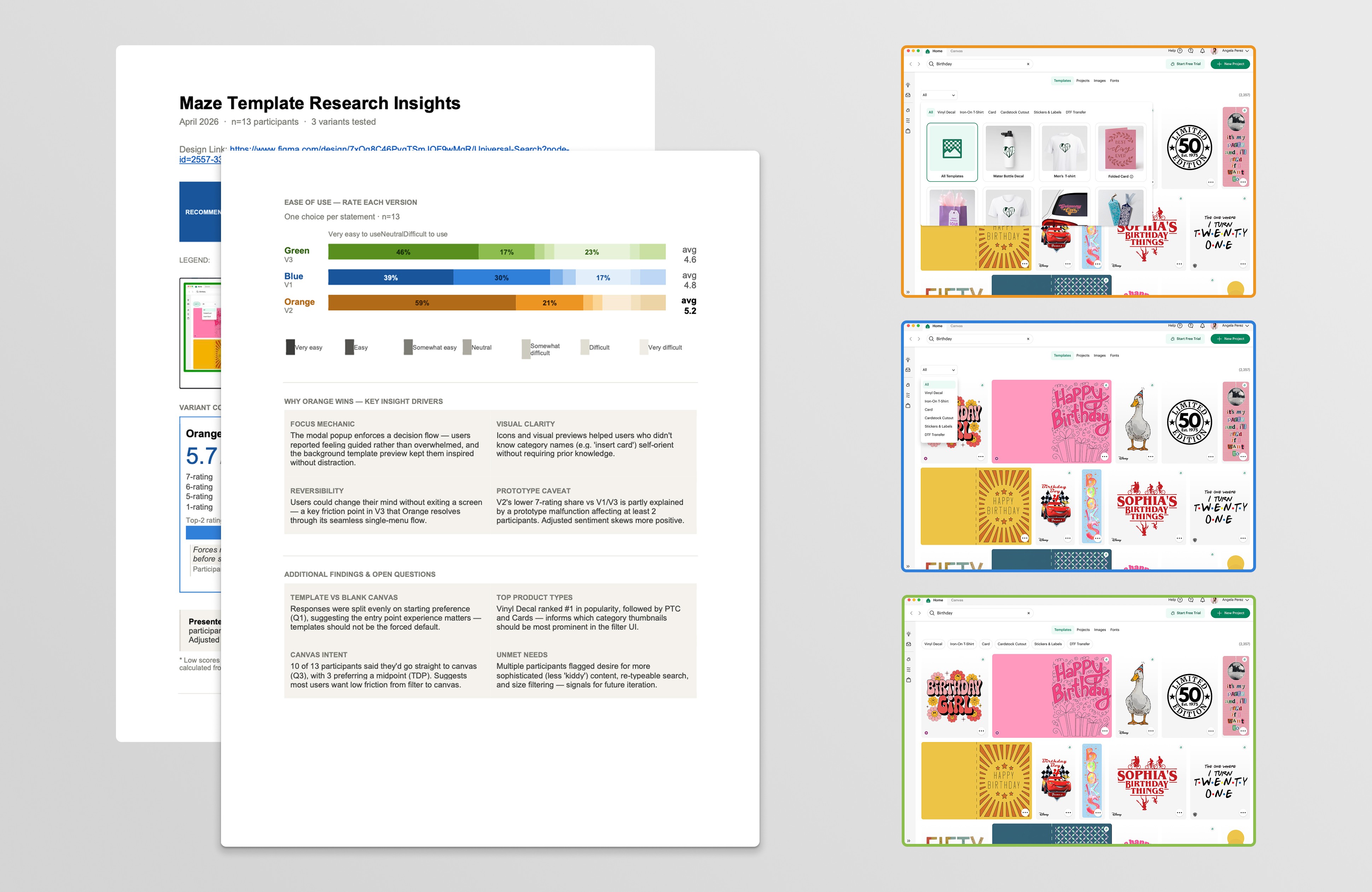
Parallel to finalizing the core system, I explored whether we could push the filter experience further on both desktop and mobile. I ran an unmoderated study testing three ways of representing filters against each other — imagery, visual chips, and a drop-down tree — and imagery won, carrying the lowest cognitive load for users. That result led us to bring the imagery-based filters into our experience. The next step was the interaction pattern itself: I built a mobile drawer with a results-based CTA — filters that surface results in place rather than sending users to a separate drill-down screen — and set it up to test against the long-standing pattern. I moved to the Subscriptions team before that test ran, so it's a comparison I designed but didn't see through.
Universal Search with visual filters + new grid built for varying tile proportions. Template filters on mobile screens with new drawer design. Dynamic template filter now with result driven CTA + sub project type filter options.
Templates shipped as a searchable content type across every platform, on time for the machine launch — giving makers a new way to start projects and extending the product's reach to a new device. It was the most systems-heavy problem I've owned: a new content type, a proportional results grid, and a dual-context filter architecture, delivered under a hard deadline.
year
2026
timeframe
2 quarters
tools
Figma
category
UI/UX
01

02

03

see also