Designing for Pace

A behavior-driven packaging concept that used visual discovery to encourage slower, more intentional consumption.

00

context

This project was completed as part of a university-sponsored design competition open to design students and faculty. The brief challenged designers to rethink beer can packaging for a bitter craft beer, encouraging more intentional consumption through design. The winning concept was selected for real-world production.

problem

Most beverage packaging is designed for quick consumption, prioritizing bold visuals over how people actually interact with the product over time. This posed a unique challenge for a bitter craft beer—where the experience improves when consumed slowly. The question became: how might packaging subtly influence pacing and engagement without interrupting the drinking experience?

old feature

Filters permanently expanded combined with left-hand navigation cover close to half the screen. This when opened decreased users vision from eight to six images.

goals

Encourage slower consumption without introducing friction or overt instruction. Design for real-world behavior, leveraging natural pauses during use. Create a shippable packaging concept that balanced brand clarity with experiential engagement.

success criteria

The interaction felt optional and intuitive, not forced or distracting. Users discovered new visual details organically as they consumed the product. The final design was production-ready and met brand and printing constraints. The concept clearly aligned packaging design with the intended pace of consumption.

I approached the problem by studying drinking behaviors, pacing patterns, and how users visually engage with packaging during moments of pause. Through lightweight research and iteration, I explored how visual discovery could be layered into the can itself, encouraging interaction without distraction.


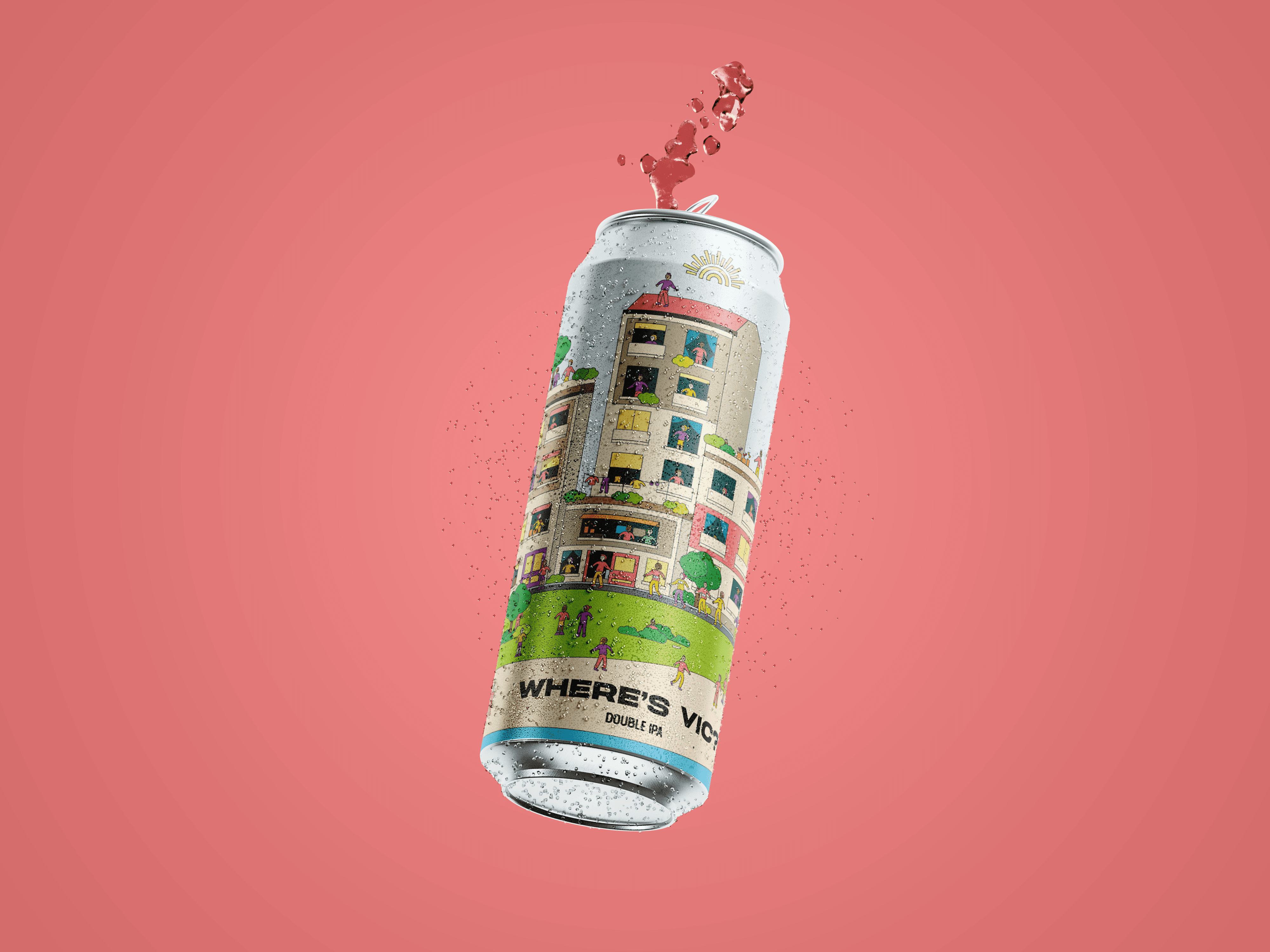
The final design introduced a subtle character search experience embedded directly into the can’s illustration. As users drank, new visual details were revealed inviting exploration during natural pauses rather than encouraging rapid consumption. This transformed the can from a static surface into a progressive experience, aligned with the product’s intended pace.


The design won first place in my design programs student / faculty design competition and was selected for real world production. More importantly, it demonstrated how packaging can shape user behavior, proving that small, intentional design decisions can meaningfully influence how a product is experienced over time.

year

2022

year

2022

year

2022

year

2022

timeframe

1 month

timeframe

1 month

timeframe

1 month

timeframe

1 month

tools

Illustrator - Figma

tools

Illustrator - Figma

tools

Illustrator - Figma

tools

Illustrator - Figma

category

UI/UX

category

UI/UX

category

UI/UX

category

UI/UX

01

The beer was a double IPA which research and some experience showed users tended to sip and enjoy rather than chug.

02

“Where’s Vic” played off the concept of “Where’s Waldo,” encouraging consumers to take their time enjoying the beer while searching for the small character on the can.

03

The can launched a year after the competition and was even sold briefly at the brand’s new location in Stillwater, OK. Fun fact: it was my drink of choice at my wedding for our guests.

Christian Van Curen © - 2026

Christian Van Curen © - 2026

Christian Van Curen © - 2026

Christian Van Curen © - 2026