Designing the Subscription Lifecycle
A reimagined subscription experience that reduces friction, improves clarity, and boosts conversion and retention across sign-up, cancellation, and payment flows.
00
context
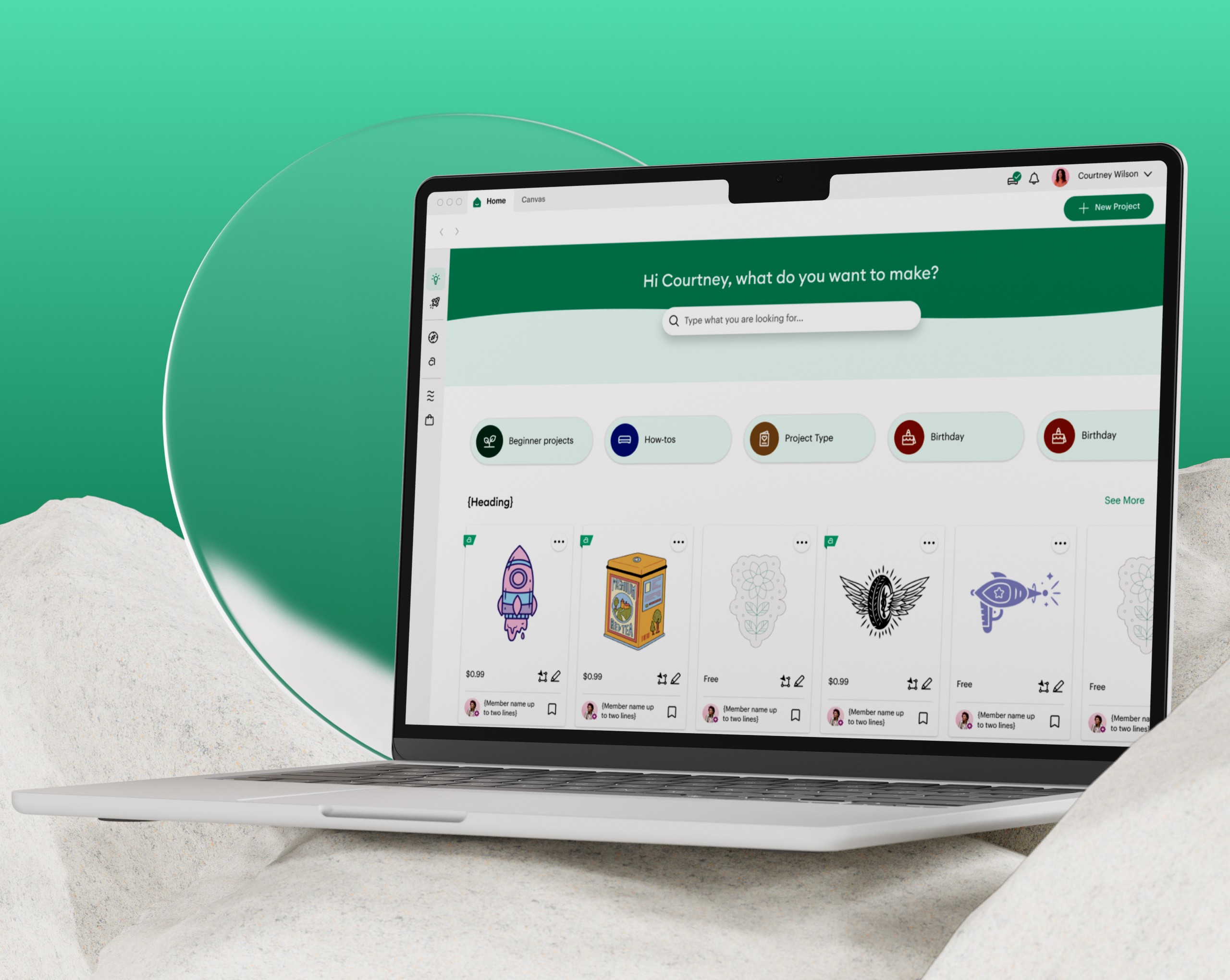
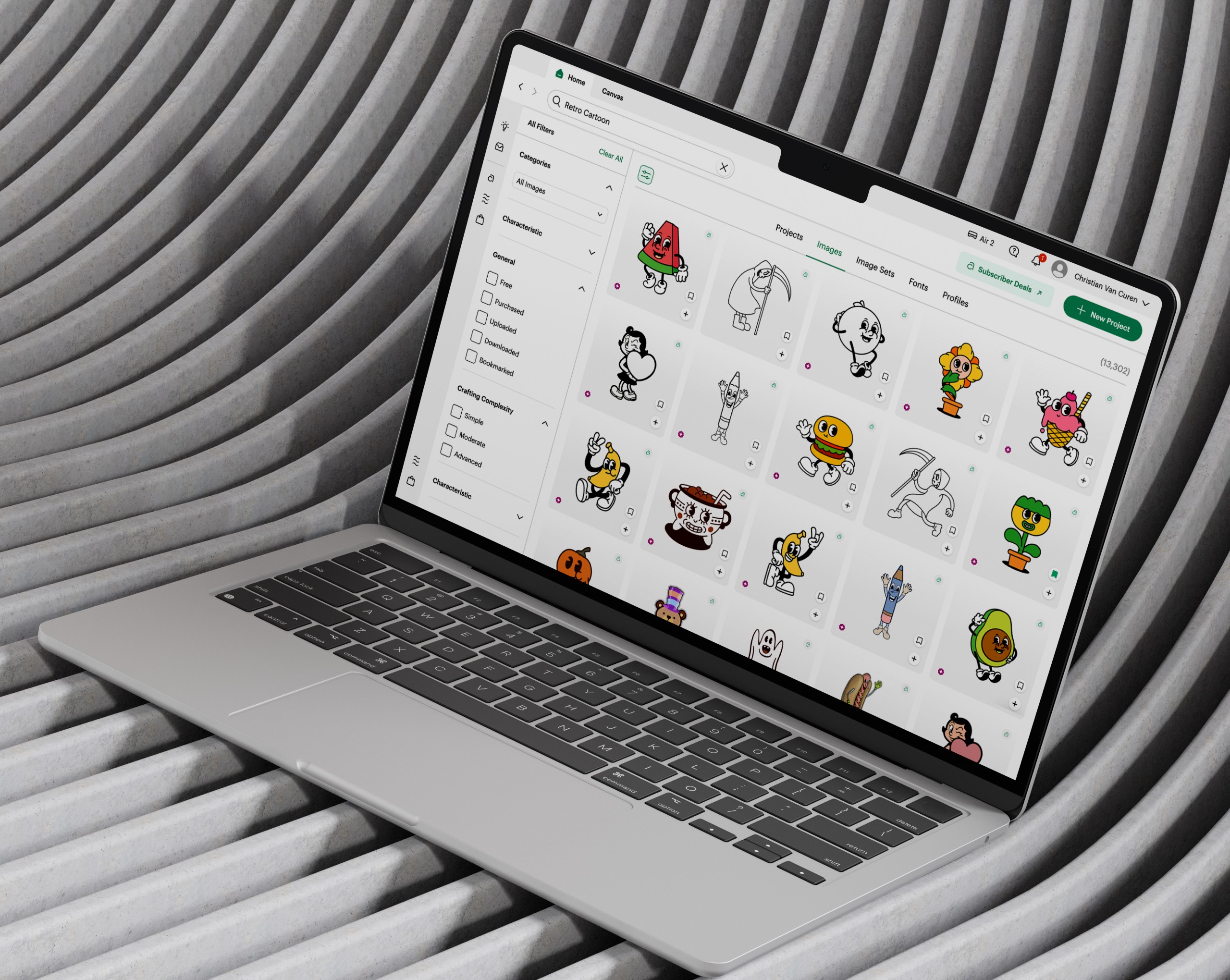
Cricut builds smart cutting machines that use Design Space, a platform that enables users to create and produce custom projects. As part of the Search & Subscriptions pod, I focused on improving discovery and monetization experiences, reducing friction, increasing efficiency, and helping users stay in their creative flow.
problem
The subscription lifecycle contained friction at multiple points, making it difficult for users to start, manage, or modify their subscriptions efficiently. These challenges impacted conversion, retention, and overall user satisfaction.
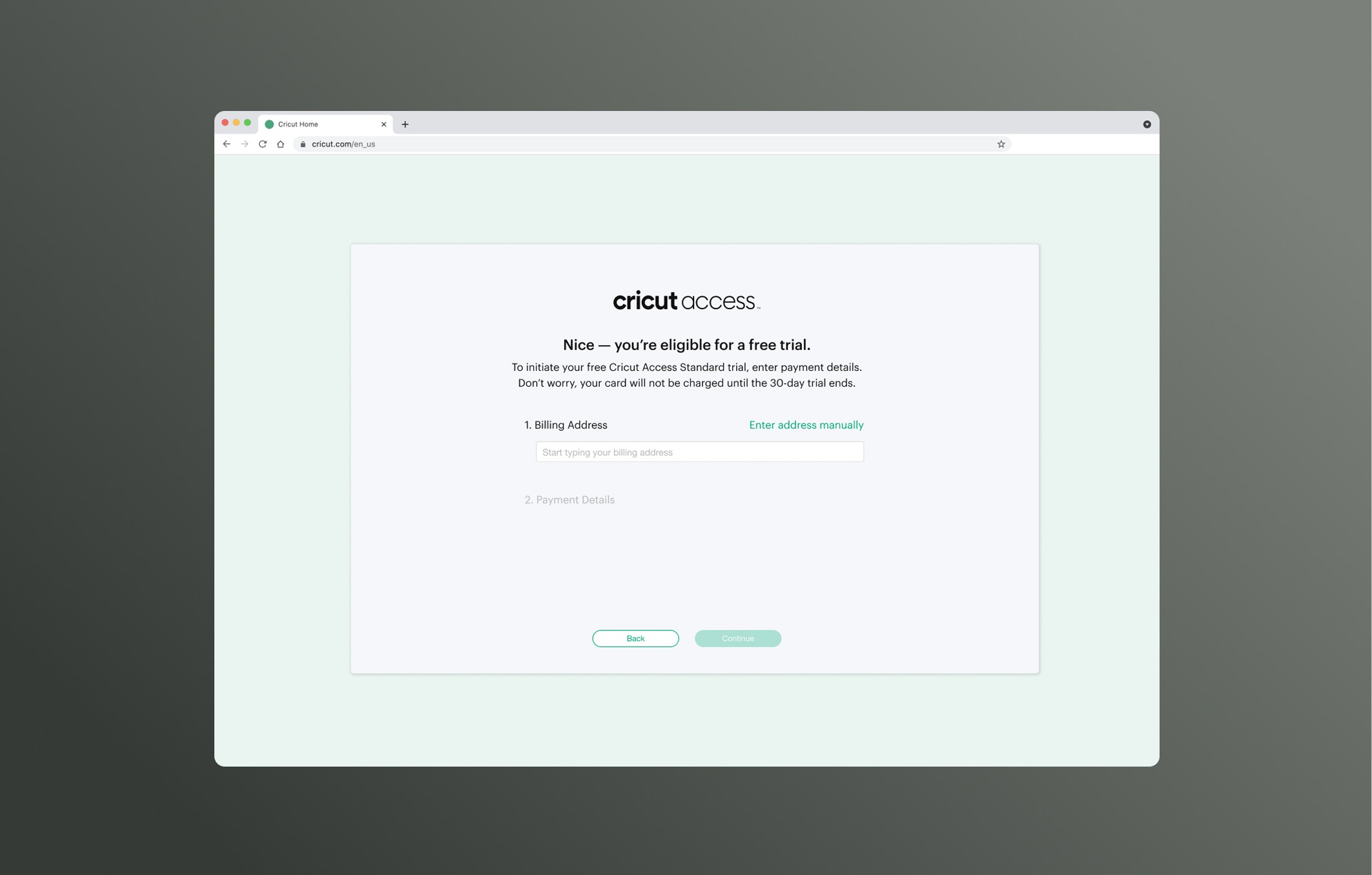
old feature
goals
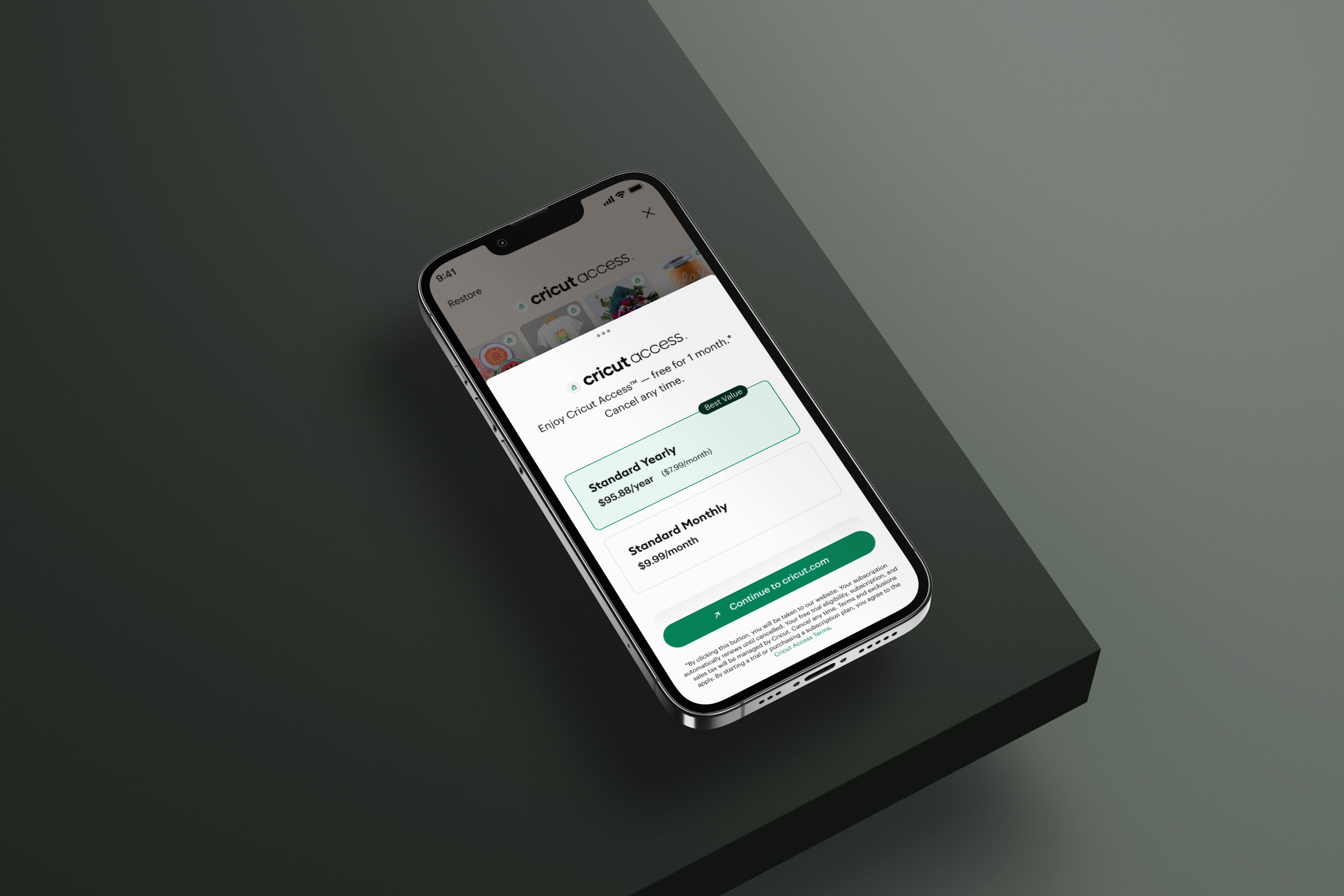
Redesign subscription flows to increase retention and conversion rates. Add new notification system and re-design "my payments" page to improve clarity. Update cancelation flow to decrease friction while also increasing opportunity.
success criteria
Users can follow "crumbs" above and easily sign up for a subscription with less clicks and screens than before. Users are now notified when their payment method is declined or expired and can easily update or select a saved card to replace it. Users can cancel their subscription with less clicks but also have the option to accept a promo offer and continue their membership.
I led research and analysis to identify pain points and uncover opportunities across the subscription lifecycle. Early concepts were validated through feedback and aligned with both product vision and development feasibility. I delivered final UX and UI designs across key flows, focusing on intuitive interactions, consistency across platforms, and clear communication. Gradual rollouts and UX reviews ensured the impact of changes could be measured and optimized.
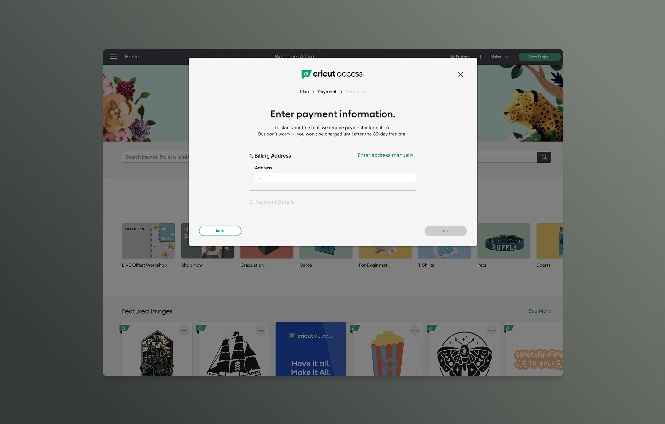
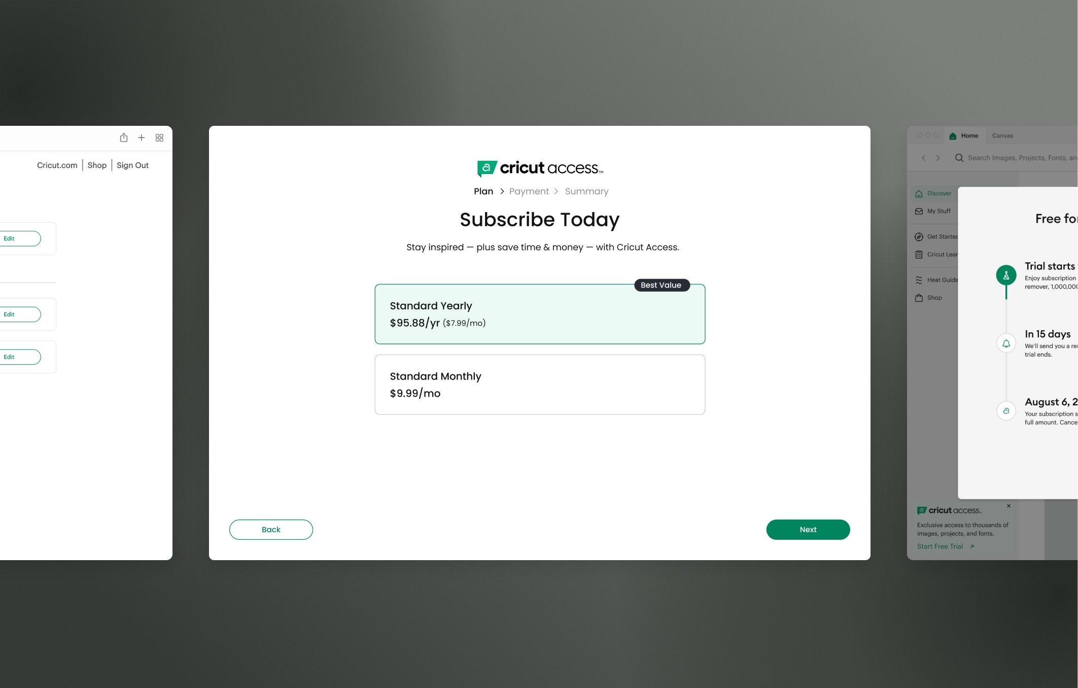
First mocks primarily focused on solving visual timeline (crumbs) that would help users understand where they were in the sign up process.
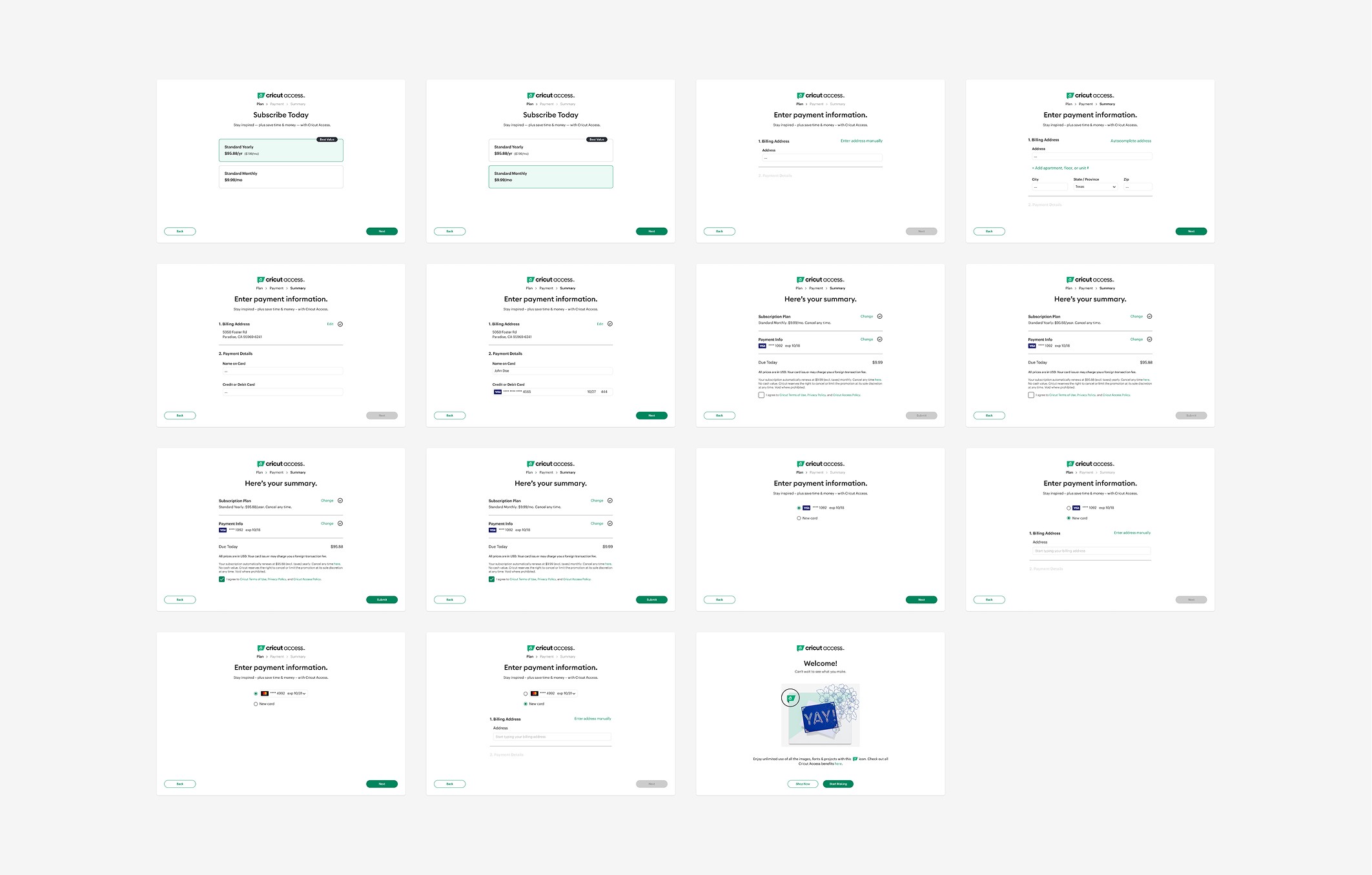
Screens above show different avenues that were explored to ensure a cohesive experience in our sign up flow.
Representative Flows (Highlights):
Sign-Up Flow (desktop, iOS, Android): Redesigned for clarity and reduced friction, improving conversion and retention.
Cancellation + Pause/Promo Options (desktop, iOS, Android): Simplified flow to reduce friction while offering retention opportunities, supporting user autonomy.
Checkout & Payment Flows (desktop, iOS, Android): Optimized checkout and payment management, reducing steps and improving flexibility with multiple payment options (Apple vs. Stripe).
Additional Features I Led:
Payment settings page for centralized account management.
Payment failure messaging to reduce drop-offs.
Stripe Payment Element to reduce checkout steps from 5 → 2.
Ongoing V2 sign-up flow - simplified two-screen experience with updated visuals and behavior.
The redesigned subscription flows simplified discovery and improved efficiency for users, reducing friction and streamlining interactions. These improvements contributed to higher conversion and retention while establishing a scalable, consistent subscription system across desktop, iOS, and Android, setting the standard for future features and platform updates.
year
2022 - 2025
timeframe
+3 years
tools
Figma
category
UI/UX
01
02
03
04
see also