Reimagining Cricut Search
Redesigned key areas of the Cricut search experience to reduce friction, improve discoverability, and help users find relevant content faster so they could spend more time creating and less time searching.
00
context
Cricut builds smart cutting machines that use Design Space, a platform that enables users to create and produce custom projects. As part of the Search & Subscriptions pod, I focused on improving discovery and monetization experiences, reducing friction, increasing efficiency, and helping users stay in their creative flow.
problem
Cricut’s search experience was largely transactional: users could enter a query and get results, but there was little guidance to help them refine their search or discover new content. This lack of structure increased search time, slowed decision-making, and disrupted users’ creative flow, resulting in fewer completed projects and a more frustrating overall experience.
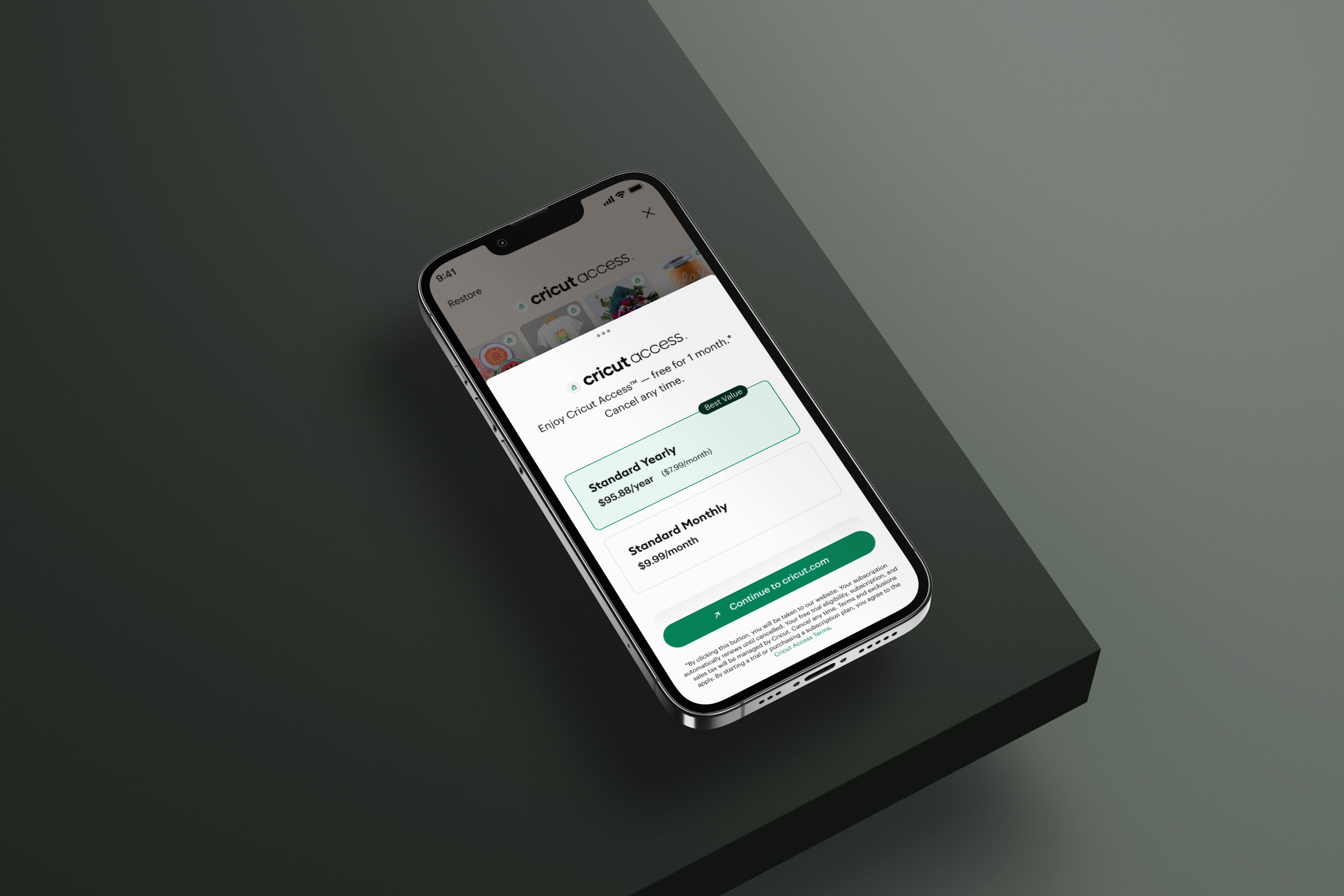
old feature

goals
Reduce search friction so users can find content faster and more intuitively. Improve discoverability by surfacing relevant projects, images, and similar content. Support creative flow by enabling users to resume work seamlessly across sessions and devices.
success criteria
Users locate desired content more quickly than before. Users engage more with recently searched items, last viewed projects, and similar images. Users report that the search experience feels faster, more intuitive, and less frustrating.
I refined the search bar and results page to help users find what they needed faster with less effort. Through user research and competitive analysis, I identified pain points and opportunities, then developed UX concepts and final UI designs that balanced product vision with feasibility. I led UX reviews and coordinated phased rollouts, ensuring the updates enhanced usability and positively impacted key metrics.
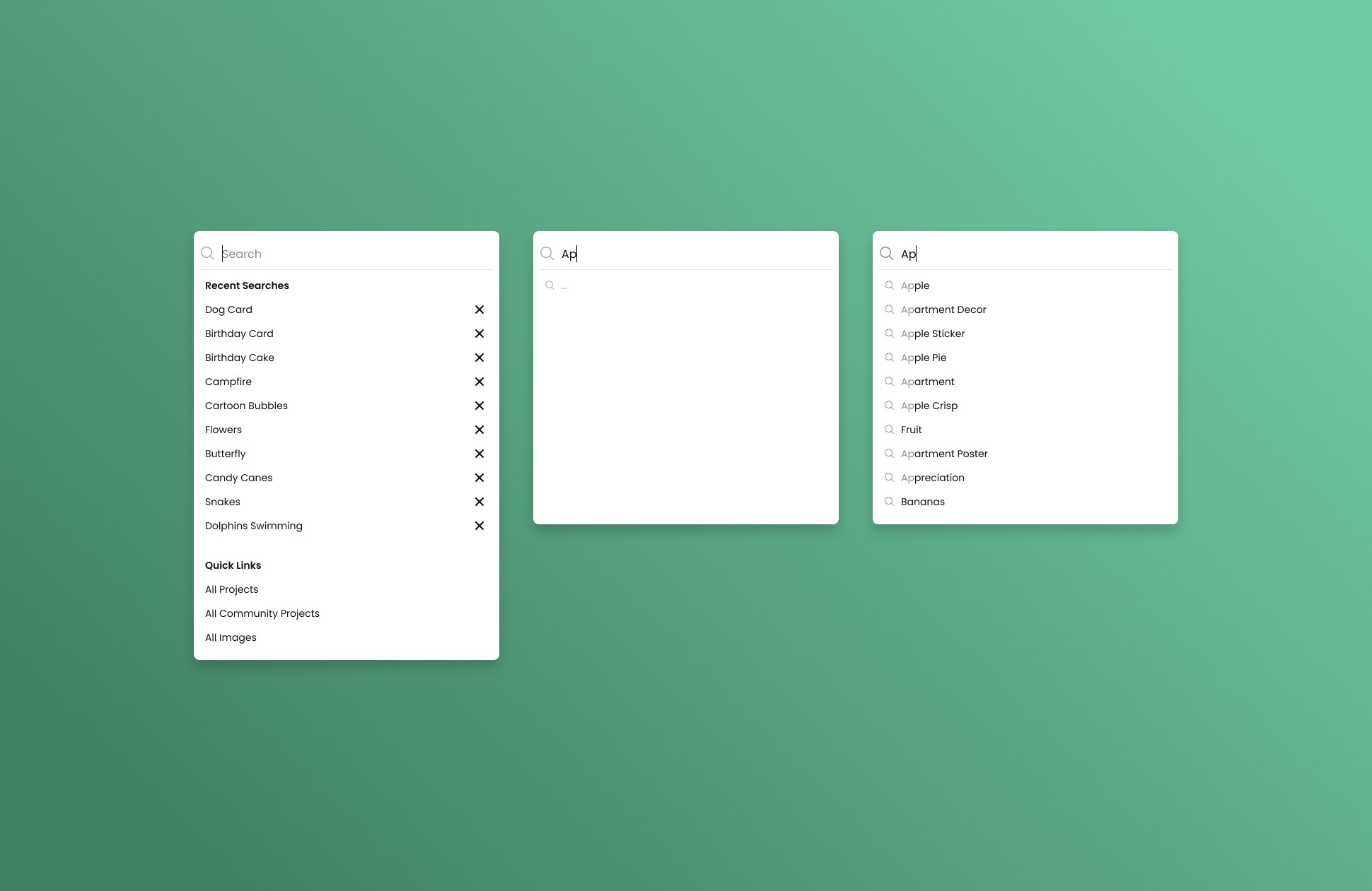
Our first initial feature that spurred further design changes was the addition of "Type Ahead" to our search bar. This helped limit the amount of time spent in the search bar.
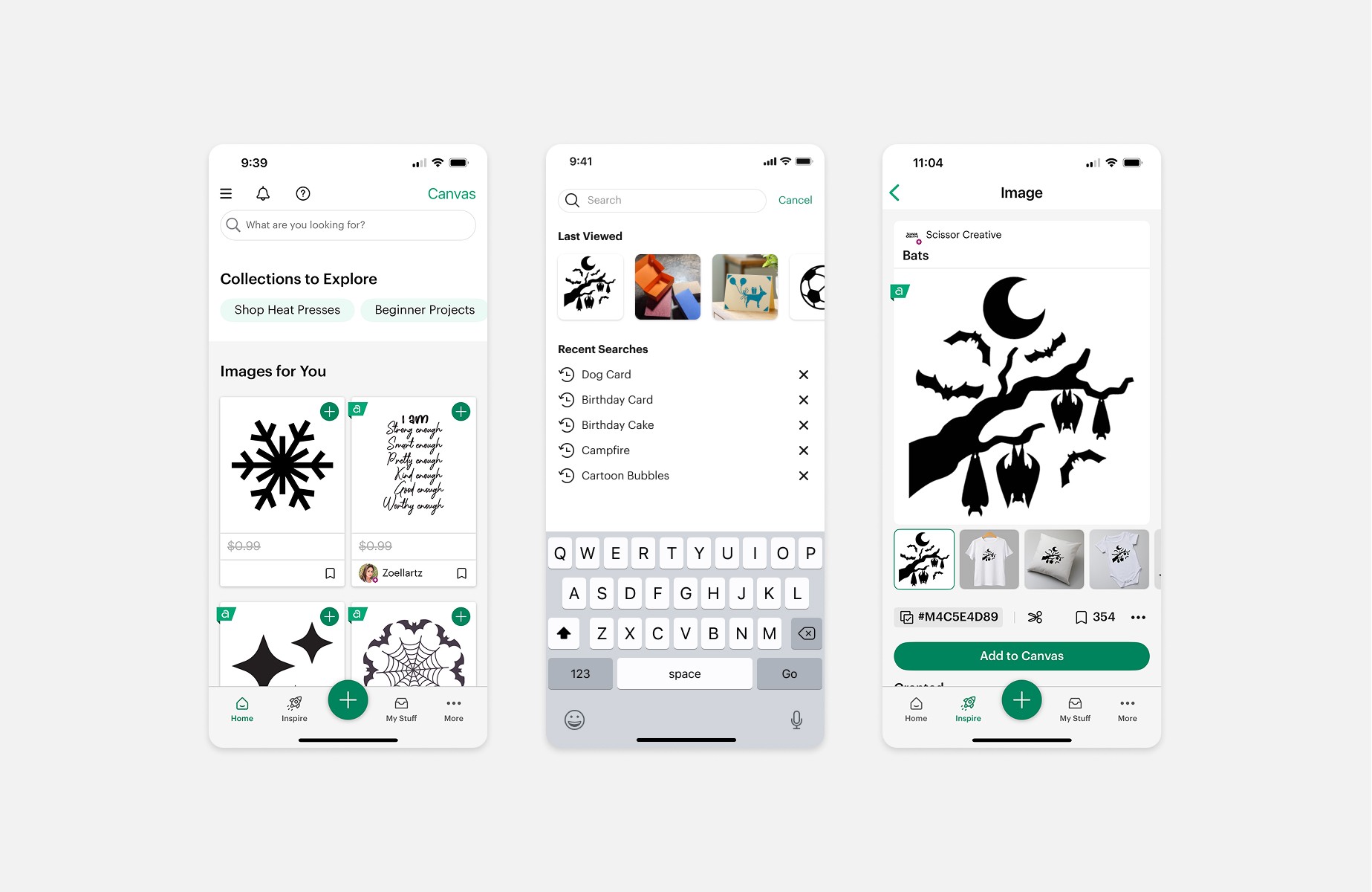
Next was another small but important project where we retained users "Last Viewed" images and projects. We wanted to help them re-engage after leaving a session.
Key UX Features I Led
Recently searched queries (desktop, iOS, Android)
Last viewed projects & images (desktop, iOS, Android)
Search query assist (desktop, iOS, Android)
Universal search layout redesign (desktop)
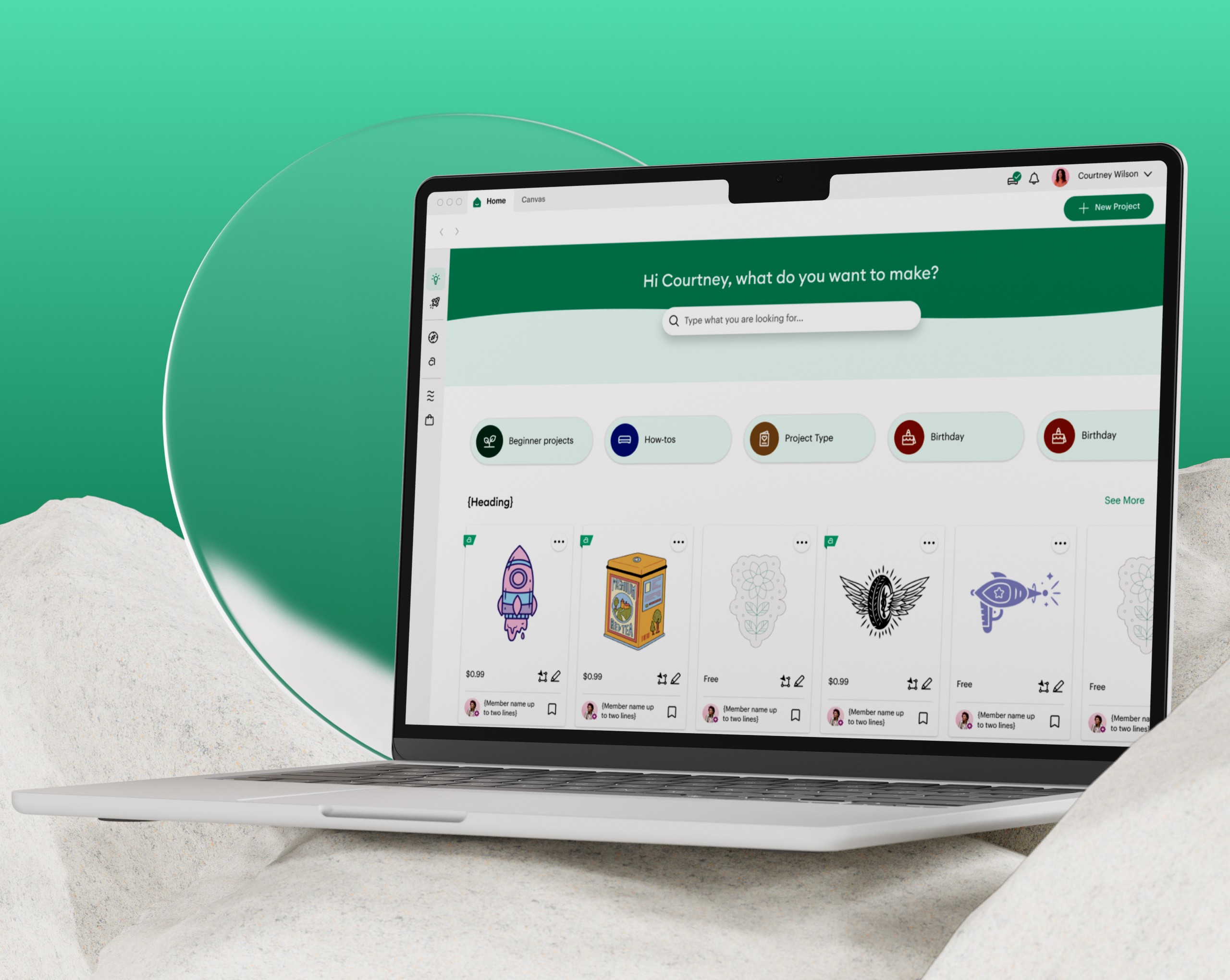
Hero search bar on home (desktop)
Search spell correction (desktop, iOS, Android)
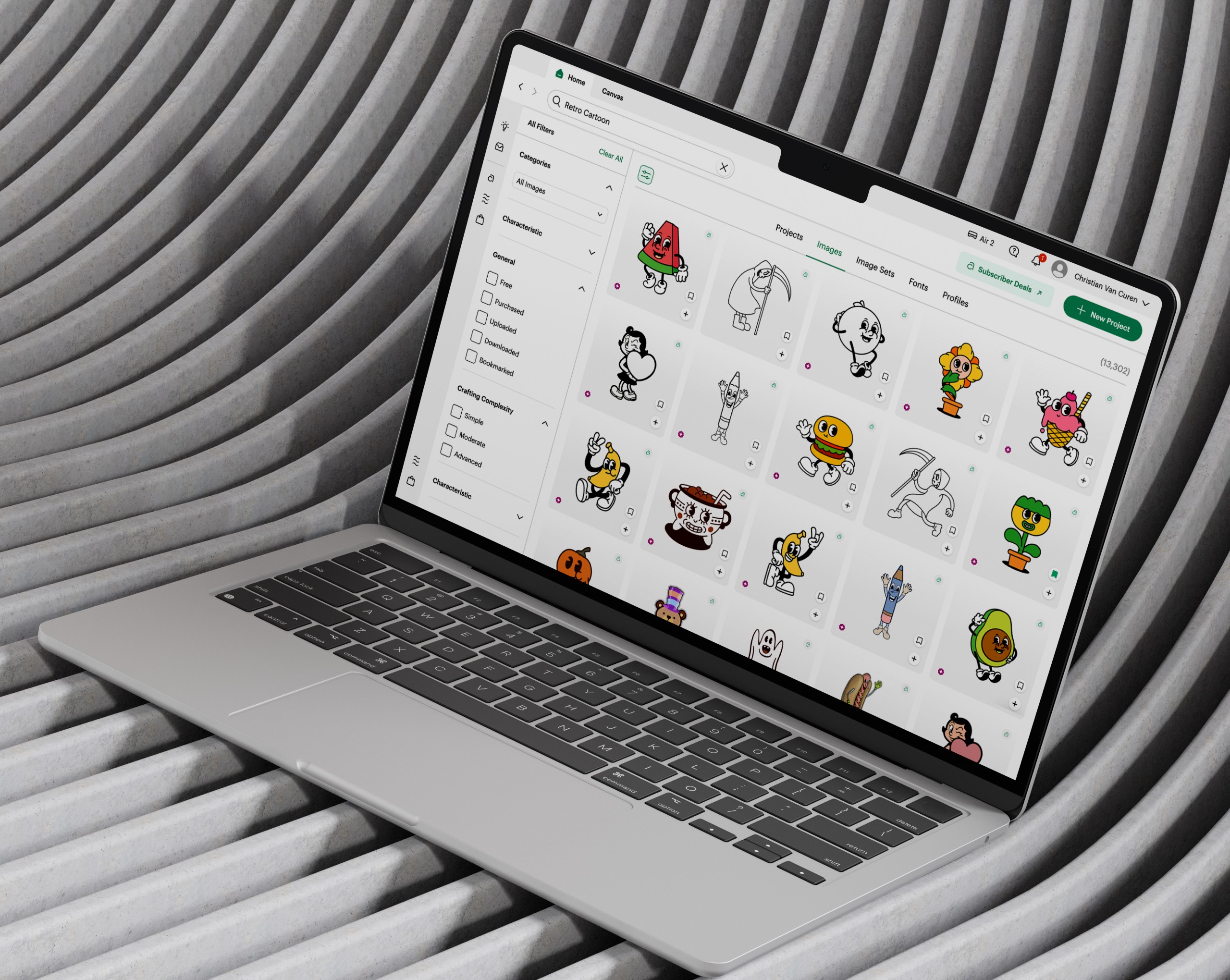
New image panel (desktop, iOS, Android)
Similar images feature (desktop)
Over the past two years, these improvements have reduced the time users spend searching and made discovery faster and more intuitive. Users can now quickly find relevant content, surface similar images from their uploads, and resume where they left off across sessions - allowing them to spend less time searching and more time creating.
year
2024 - 2025
timeframe
+2 years
tools
Figma
category
UI/UX
01

02

03

see also